A customer had realized their electric costs were increasing this summer. We looked into the occurrence within their facility, which shows a couple key points:
- Last year regulators approved a change to pull some of the transmission costs out of the generation, or the “market portion” of the bill. This pushes costs back into the regulated components of the bill.
- The base rate represents the costs for your meter to be on the grid (customer charge) and the cost for your instantaneous electric load (peak demand). The recently adjusted AEP-Ohio line items are for Deferred Asset Phase-in Rider and Distribution Investment Rider which combined increase the base rate by 1.2%.
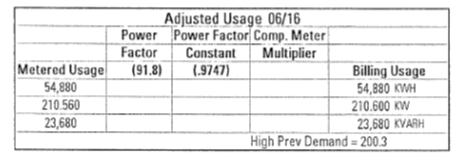
- Lastly, when concurrent use of equipment – all the lights on, while air conditioning, and office equipment is up and running – can cause a temporary spike, or peak, in use which is billed a peak demand.
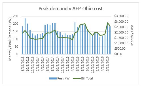
This past summer there was one month (June 2016, 211 kW) with a peak kW which exceeds the previous peak demand. The previous high was set in September 2013 at 236 kW.
So, really there is no one reasons electric bills have risen, but the combination of rate structure increases and equipment operations – poor control, aging equipment, or all these factors together.